
Showing posts with label dataviz. Show all posts
Showing posts with label dataviz. Show all posts
9 Mar 2016
The bees and its keepers' duties
Beekeeping is a great hobby I think. It is pretty intense requiring monitoring and actions throughout the year. Here a 'bee calendar' showing the hype in the hive and the role of the beekeeper when keeping bees in a country like The Netherlands:
6 Feb 2015
Akvo timeline visualizations
On January 20th 2015, my colleague Alvaro de Salvo shared the raw data file of the timeline of Akvo 2006-2014 in a blog post. Here my go at using the data for some visualizations for which I used 'RAW'. Click the image to enlarge.


Bump Chart on the count on news categories, per year.

Circular dendrogram of news items except funding per category per year.

Treemap of the income per year. The subdivision per year indicate the size of various income sources.
24 Apr 2012
Mapping Wikipedia
 'Mapping Wikipedia is a groundbreaking visualisation of the world mapped according to articles in 7 different languages' Read more..
26 Jun 2011
Plenty more fish in the sea?
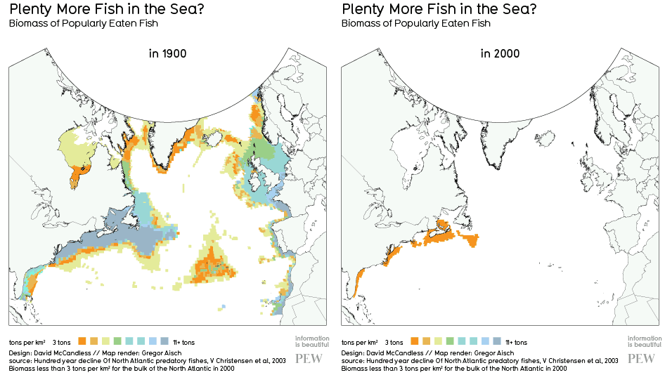
"It's hard to imagine the damage over-fishing is wrecking on the oceans. The effects are literally invisible, hidden deep in the ocean. But there is data out there. And when you visualise it, the results are shocking" - See more on Information is Beautiful. (@guardian). Find out what you can do in e.g. "Which fish are good to eat". I've started working on a prezi presentation with an overview on overfishing
23 Jun 2011
"Let my dataset change your mindset"
 Brilliant free software to discover trends in large datasets. Great 'TED talk' too by Hans Rosling (the guy on the image) named "Let my dataset change your mindset". Find out all about 'Gapminder' here.
2 Feb 2011
Altas of experience
 A book with maps by Louise van Swaaji and Jean Klare. 'Human beings have long been addicted to maps: they tell us where we are, how we got where we are, and where we are going next. But The Atlas of Experience is no ordinary book of maps' - Amazon.
LinkedIN network visualisation
 A new tool in the LinkedIN Lab set called Inmaps answering the question 'what does my network look like' as explained in the Youtube video on the same.
The clusters represent various closely linked groups; companies, interest groups, family. Smart tool. Read an extensive analysis of Whitney's network in her blog post "Hubs and Connectors: Understanding Networks Through Data Visualization" here.
22 Jan 2011

28 Dec 2010
Infographic: Dietary supplements
 Which supplements really do something and which don't? This infographic by David McCandless can be found on the blog 'Information is Beautiful'. It's a very smart visualisation giving immediate insight in a complex subject. Click here to see the full infographic.
21 Dec 2009
Remoteness and other visualizations
 What do you think is the most remote place on earth? It turns out to be the Tibetan plateau (34.7°N, 85.7°E), not less than three weeks from anywhere.. Source.
 29 May 2008
Infosthetics

In June I came across this site where ideas, tools and concepts on visualisation of data are collected. Really a great source of inspiration and kept up-to-date very well. The site is called Infosthetics 'Form Follows Data'. The image here is from a tool called Wordle. You can create your own Wordle, e.g. enter the url of your blog like I did here.
Subscribe to:
Posts (Atom)